
Galentine’s Day has evolved far beyond a simple calendar date. It has become a celebration of friendship, self-care, and the joy of creating spaces that nurture us. While traditional Valentine’s decor often leans heavily into bold crimson and heart motifs, the modern UK aesthetic calls for something softer, more sophisticated, and enduring. We call this approach “quiet luxury”—a style that whispers rather than shouts.
Whether you are hosting a pamper night for your closest friends or simply treating yourself to a winter bedroom refresh, the secret lies in the colour palette. By shifting away from harsh contrasts and embracing tonal layering, you can create a bedroom that feels like a boutique hotel suite. Below, we explore five distinct palettes—Rose, Oat, Mocha, Berry, and Soft Grey—and how to style them using the 60/30/10 rule for a perfectly balanced retreat.

Palette 1: The Modern Romantic (Dusty Rose & Sage)
Forget bubblegum pink; the modern romantic palette is grounded, earthy, and undeniably elegant. This look combines the softness of dusty rose and blush with the calming influence of sage green. It is the perfect choice for those who want their space to feel nurturing and gentle.
How to style it: Use a blush tone as your primary bedding colour (60%). Introduce depth with sage green cushions or a throw (30%), and finish with touches of vintage gold or warm wood (10%). The textures here should be fluid and tactile—think jacquards that mimic natural veins or silky Tencel that drapes effortlessly.
The Modern Romantic Palette
- Dusty Rose
- Pale Blush
- Sage Green
- Cream
- Antique Gold
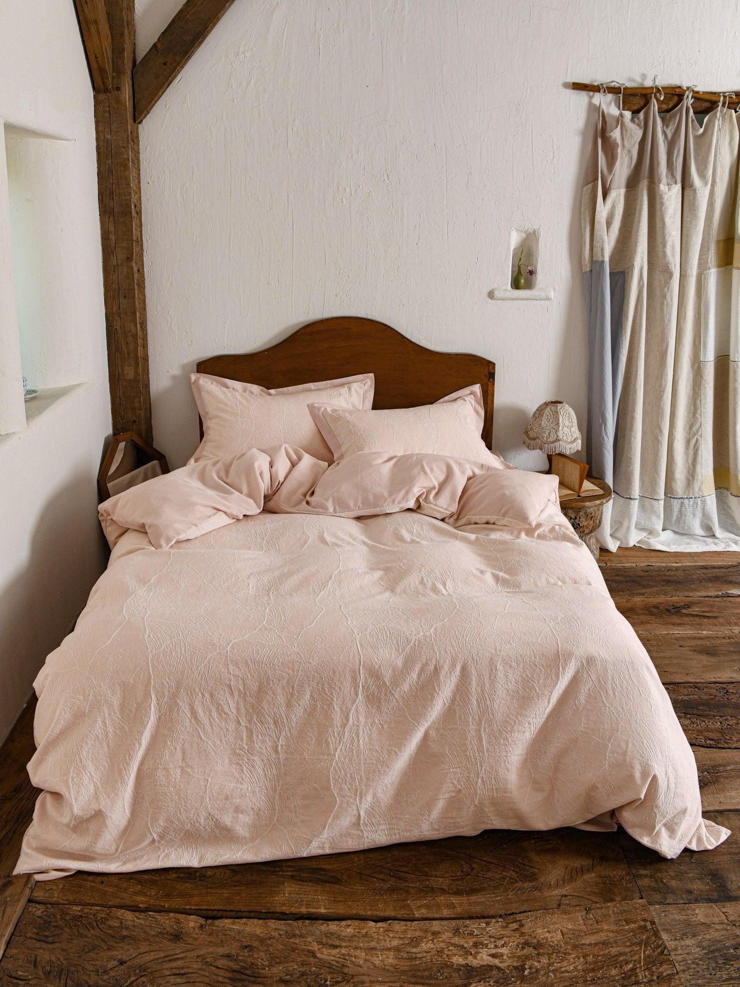
Glacier Vein Jacquard Cotton Bedding Set - Blush Rose
Inspired by natural ice formations, this blush pink set features a subtle jacquard texture that adds sophistication without overwhelming the room.
Shop Now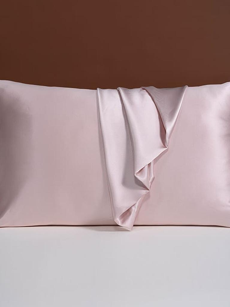
25 Momme Silk Pillowcase with Bow Ties - Pink
Treat your hair and skin to pure Mulberry silk. The delicate bow tie detail adds a quintessential coquette touch to your Galentine’s setup.
Shop Now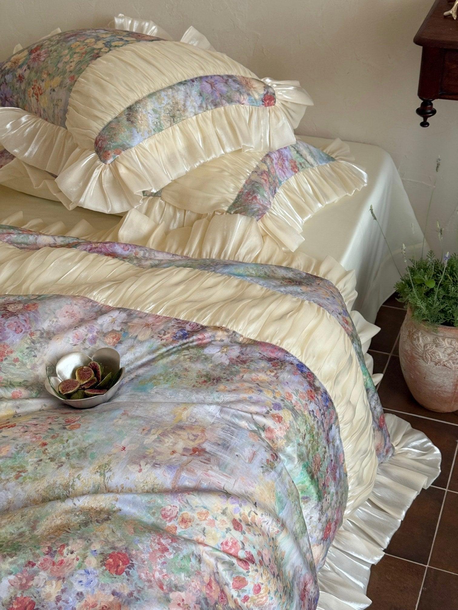
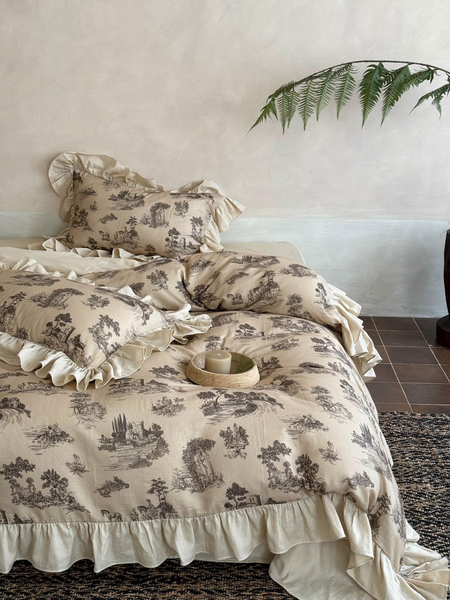
Roseveil Garden Ruched & Ruffle Tencel Bedding Set
For maximum romance, this Tencel set combines painterly florals with artisanal smocking and ruffles. It drapes beautifully and feels cool to the touch.
Shop Now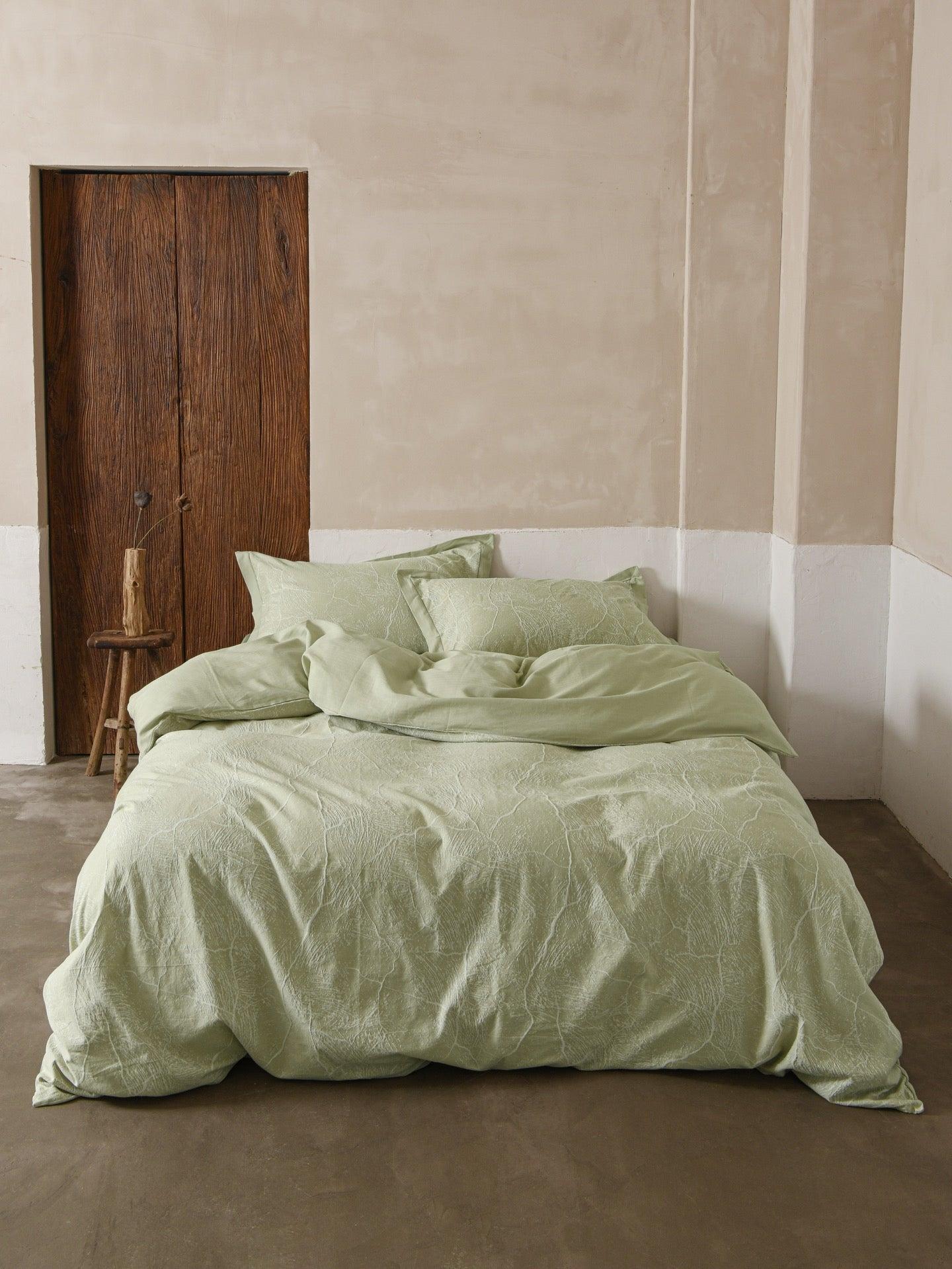
Glacier Vein Jacquard Cotton Bedding Set - Sage Green
Balance the pink tones with this calming Sage Green bedding. The 100% long-staple cotton ensures breathability and softness.
Shop NowPalette 2: The Oat Minimalist (Cream & Beige)
There is a profound comfort in neutrals. The Oat palette borrows from the Scandi and Japandi trends, focusing on warmth through texture rather than colour. It is ideal for a "clean slate" refresh, helping to clear the mind and promote restful sleep.
How to style it: Layer different shades of white, cream, and beige. A flat white sheet against a textured oatmeal duvet cover creates instant dimension. To keep it from looking flat, mix materials: pair crisp cotton with the rustic charm of muslin gauze. Accent with dried flowers or a rattan headboard.
The Oat Minimalist Palette
- Oatmeal
- Off-White
- Sand
- Linen
- Driftwood
Willowbrook Toile Muslin Gauze Ruffle Bedding Set - Beige
The ultimate in texture. This set combines a nostalgic toile print with the airy, lived-in feel of crinkled muslin gauze. Perfectly imperfect.
Shop Now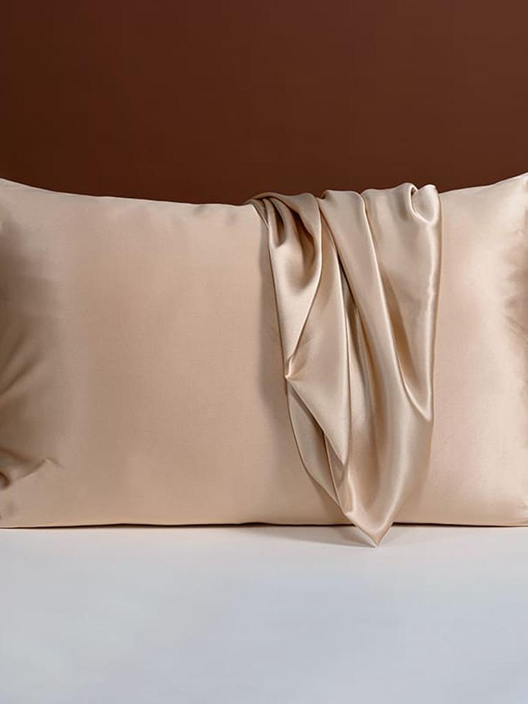
25 Momme Silk Pillowcase with Bow Ties - Champagne
Add a hint of sheen to your matte bedding layers. Champagne silk offers a warm glow that complements beige and oat tones beautifully.
Shop Now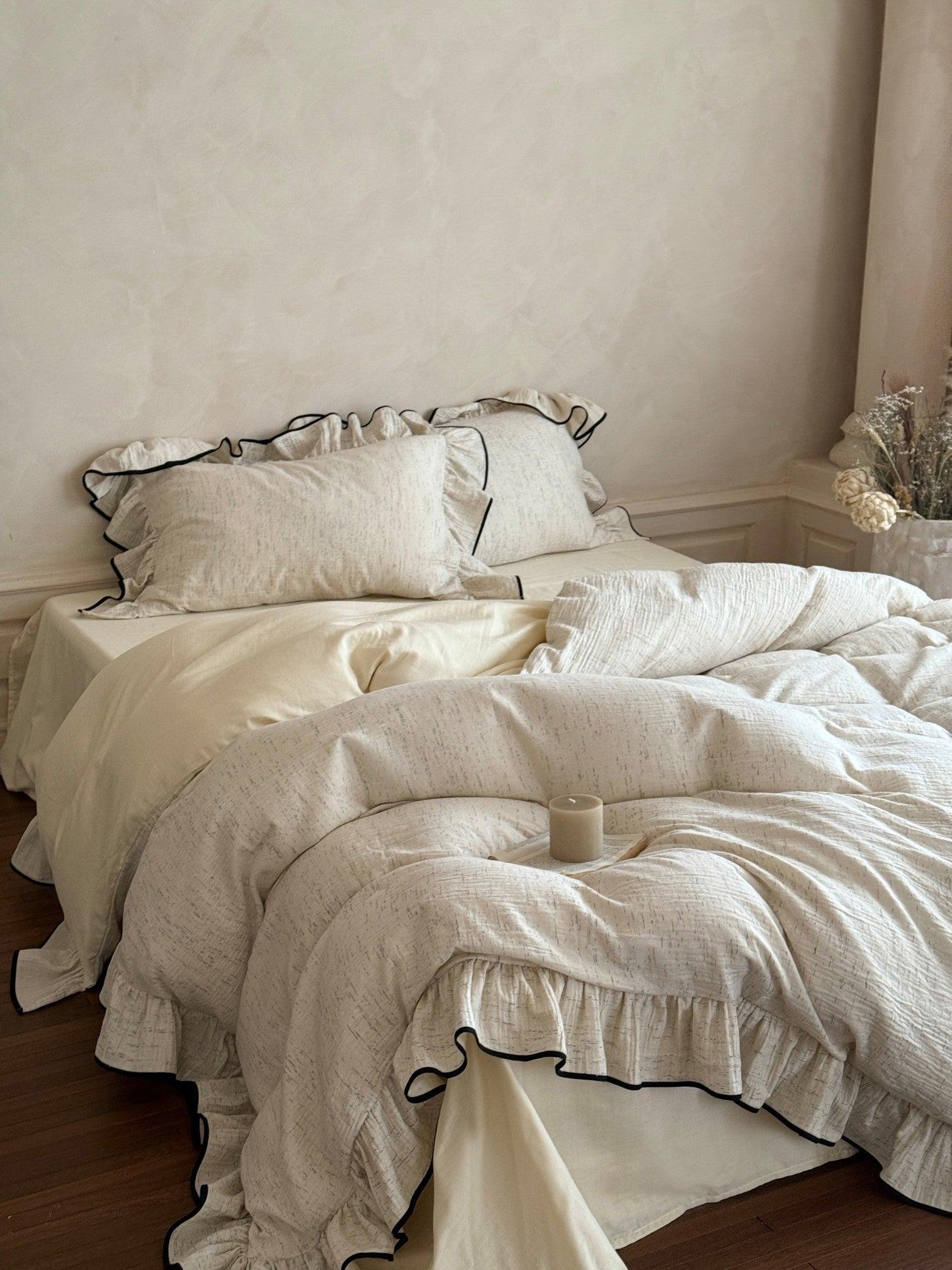
Ivory Whisper Ruffle Cotton Bedding Set
A blend of soft satin-dyed cotton and airy muslin gauze. Minimalist yet romantic, this is quiet luxury defined.
Shop Now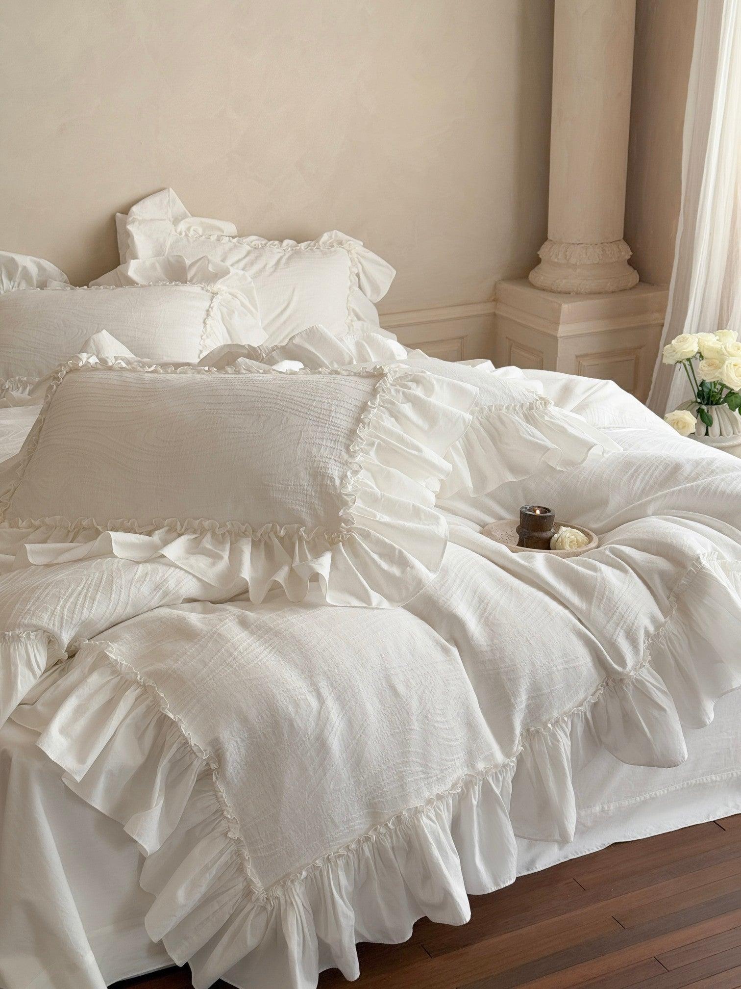
Soft-Grain Jacquard Cotton Ruffle Bedding
Featuring a subtle grain pattern for depth, this set balances structure with softness via its delicate ruffle detailing.
Shop NowQuiz: Which Galentine’s Palette Is You?
1. Your ideal Saturday night is:
2. Which texture do you love most?
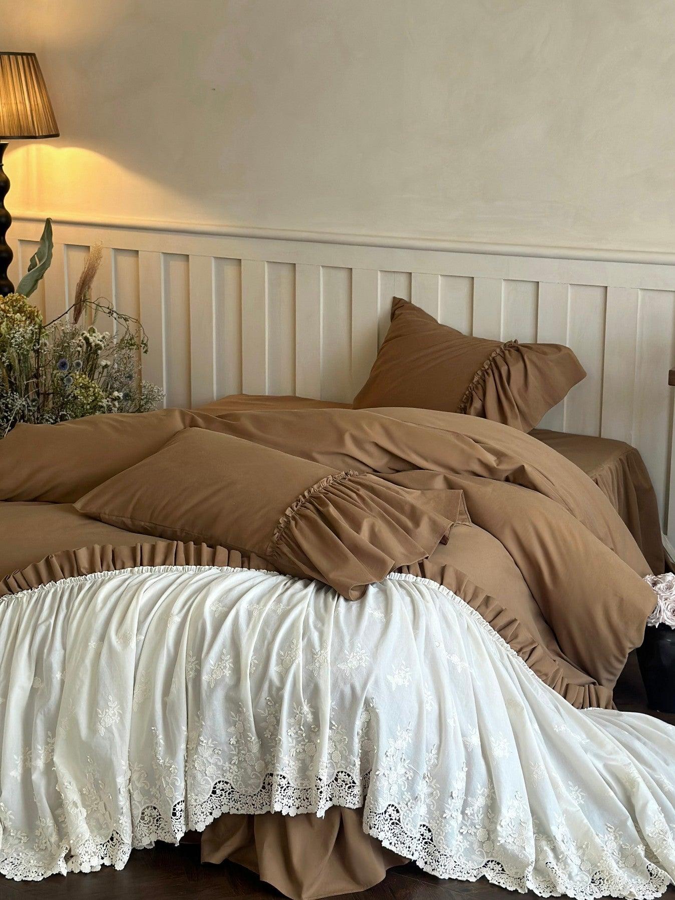
Palette 3: Mocha & Latte (The Warmth-Seeker)
Brown has reclaimed its spot as a premier interior colour, offering a warmth that cool greys simply cannot match. The Mocha palette ranges from deep espresso to creamy latte shades. It creates a "cocooning" effect that is perfect for hibernating during the late UK winter.
How to style it: This look relies on rich, light-absorbing fabrics. Think brushed cottons and velvets. Use a deep brown duvet cover as your anchor, then lighten the look with caramel sheets or gold accents to prevent the room from feeling too dark. A pop of velvet in a cushion adds instant luxury.
The Mocha Palette
- Espresso
- Coffee
- Caramel
- Tan
- Gold
Earth-Tone Brushed Sateen Lace Ruffle Bedding Set
The gentle sheen of brushed sateen meets warm earth tones. Delicate white lace ruffle detailing provides a vintage-inspired contrast to the deep warmth.
Shop Now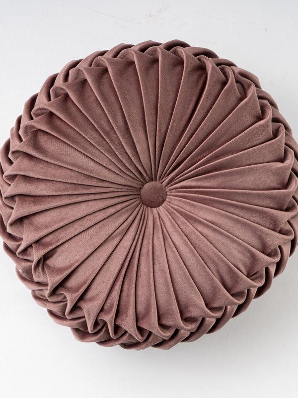
Colorful Round Pleated Velvet Cushion - Coffee
Add a luxe touch with this hand-pleated velvet cushion in a rich coffee shade. It’s the perfect accent piece to elevate neutral bedding.
Shop Now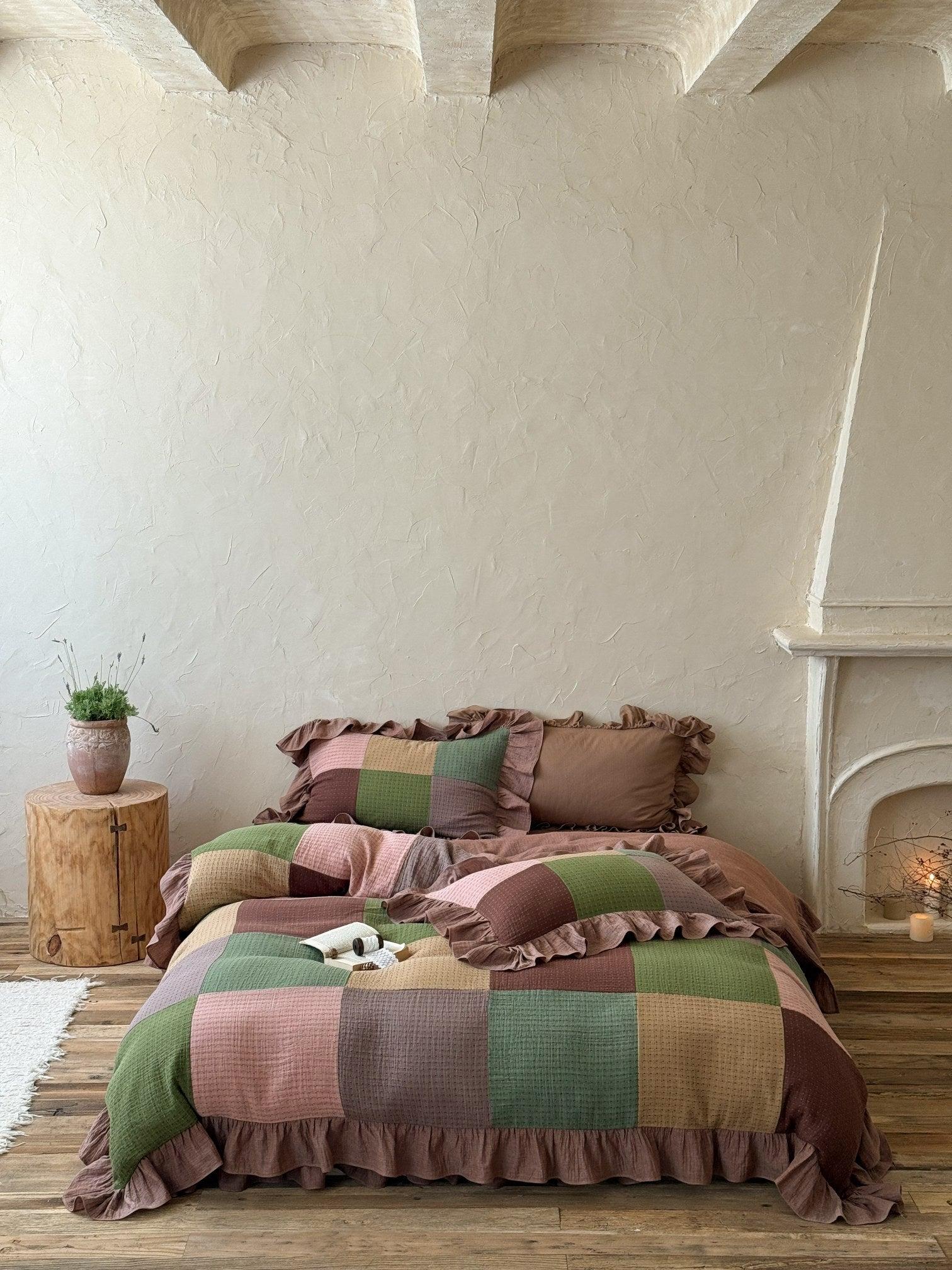
Autumn Patchwork Gauze Ruffle Bedding Set
Blending warm browns with muted greens, this muslin gauze set offers breathable, lightweight comfort with a rustic aesthetic.
Shop Now
22 Momme Mulberry Silk Sheet - Gold
For ultimate indulgence, slip into gold silk sheets. They regulate temperature beautifully and add a regal touch to the Mocha palette.
Shop NowPalette 4: Berry & Bloom (The Statement Maker)
For those who love colour, the Berry palette offers a sophisticated way to do "red" without feeling like a cliché. We are looking at deep cranberries, mulberries, and rich reds offset by crisp whites or creams. It is vibrant, energetic, and full of character.
How to style it: Gingham is a fantastic way to introduce red in a way that feels cottage-core rather than chaotic. Pair a red gingham duvet with solid white sheets to keep the look fresh. Darker berry tones work beautifully in velvet accents or within floral prints that add a moody, romantic depth.
The Berry Palette
- Burgundy
- Rose Red
- Crisp White
- Merlot
- Soft Pink
Sweet Gingham Ruffle Bedding
Classic red and white gingham meets airy cotton gauze. The ruffled edges add a playful, nostalgic charm perfect for a cozy night in.
Shop Now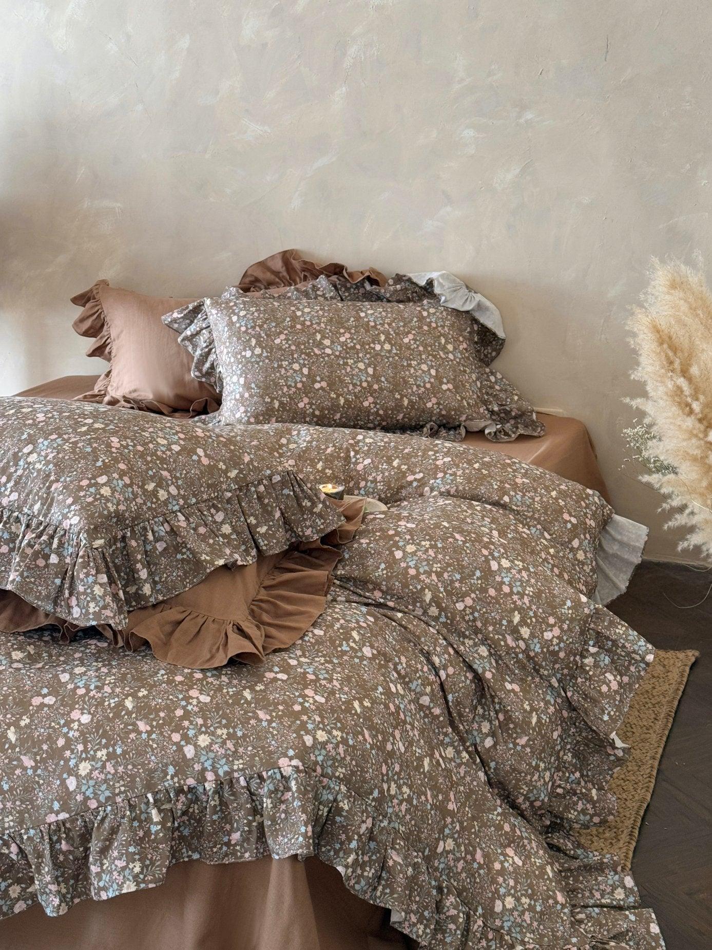
Autumn Meadow Ruffle Muslin Gauze Bedding Set
Reimagined with deeper floral tones, this set offers a warmer, more grounded take on the berry palette, perfect for sophisticated styling.
Shop Now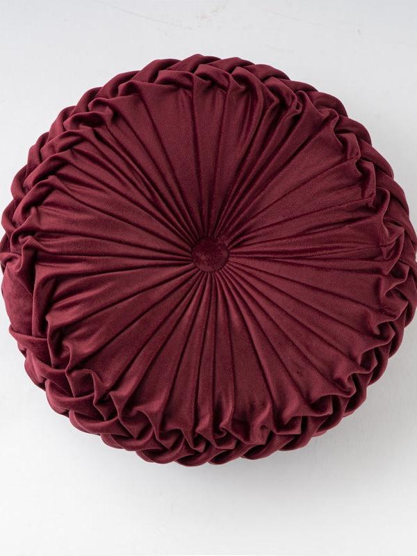
Colorful Round Pleated Velvet Cushion - Burgundy
Inject a pop of deep colour with this plush burgundy cushion. The pleated design adds texture and luxury to any bedspread.
Shop Now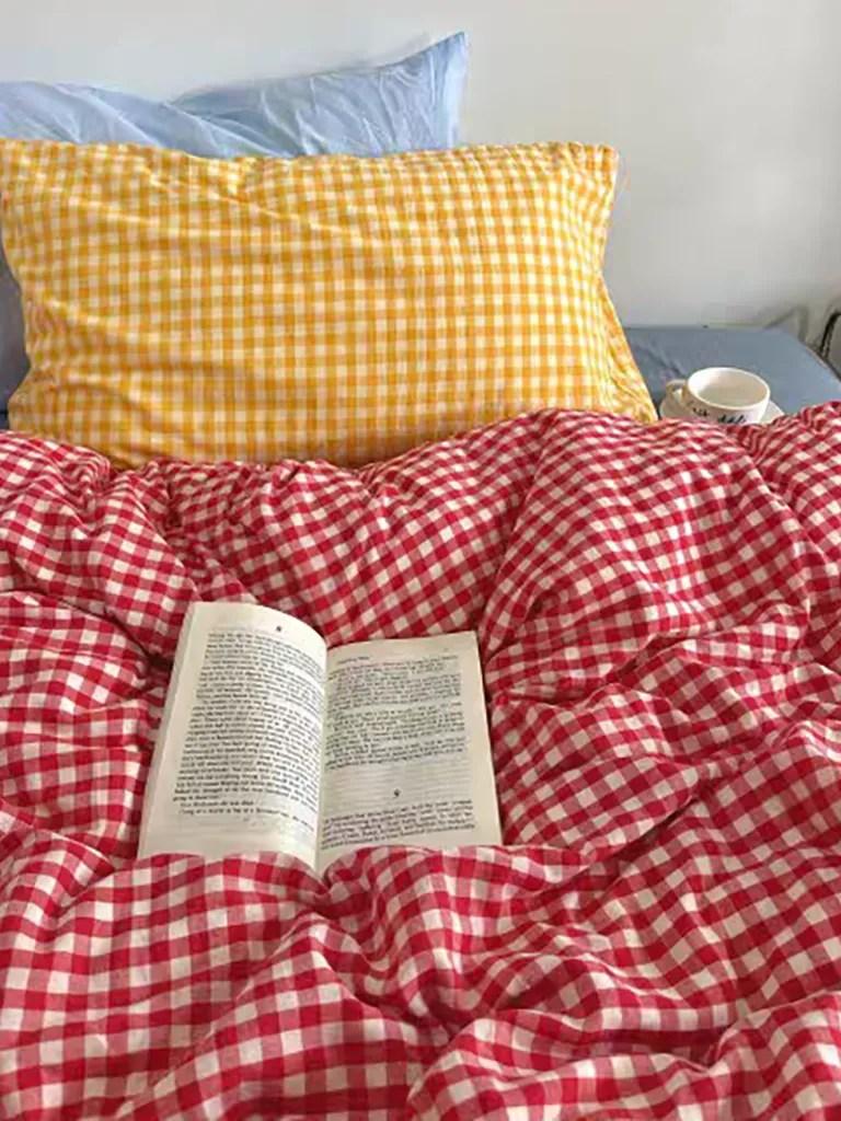
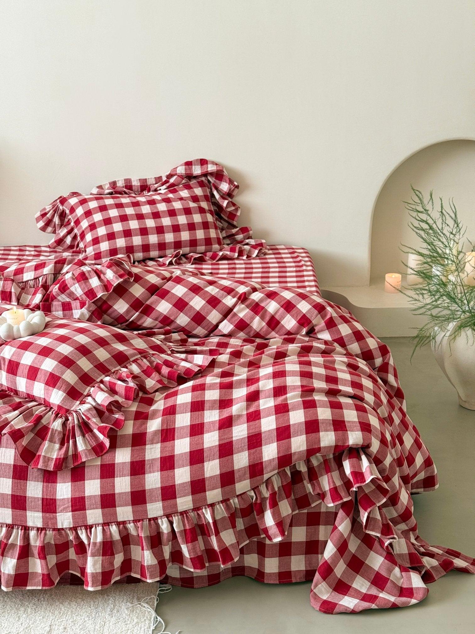
Cotton Small Gingham Duvet Cover Set - Vintage Red
For a bolder statement, this vintage red gingham set brings country-house warmth and a rich pop of colour to neutral rooms.
Shop NowPalette 5: Soft Grey (The Serene)
For those who find colour overwhelming, the Soft Grey palette is a sanctuary of calm. This isn't the cold, industrial grey of the past; it is a "warm grey" often mixed with hints of mist, blue, or taupe. It is ethereal, light, and endlessly versatile.
How to style it: To prevent grey from feeling flat, focus on pattern and weave. Seersucker is excellent here, as the puckered texture creates natural shadows and highlights. Pair pale grey bedding with plush white towels and robes for a true spa-at-home experience.
The Soft Grey Palette
- Mist
- Blue-Grey
- Ghost White
- Dark Grey
- Silver
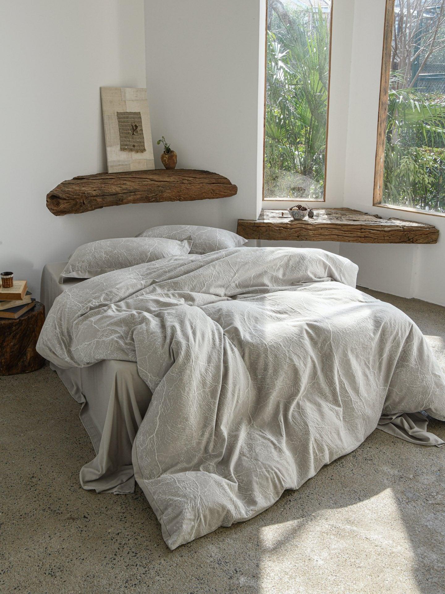
Glacier Vein Jacquard Cotton Bedding Set - Mist Grey
The refined jacquard weave gives this mist grey bedding subtle depth. It’s lightweight, modern, and pairs effortlessly with white or silver accents.
Shop Now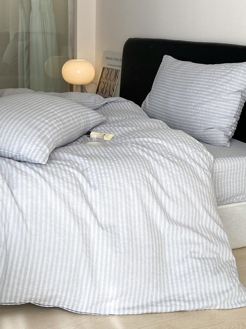
Frostline Stripe Seersucker Duvet Cover
Cool and crisp, this pale frost-gray seersucker cover requires no ironing and adds instant texture to a minimalist room.
Shop Now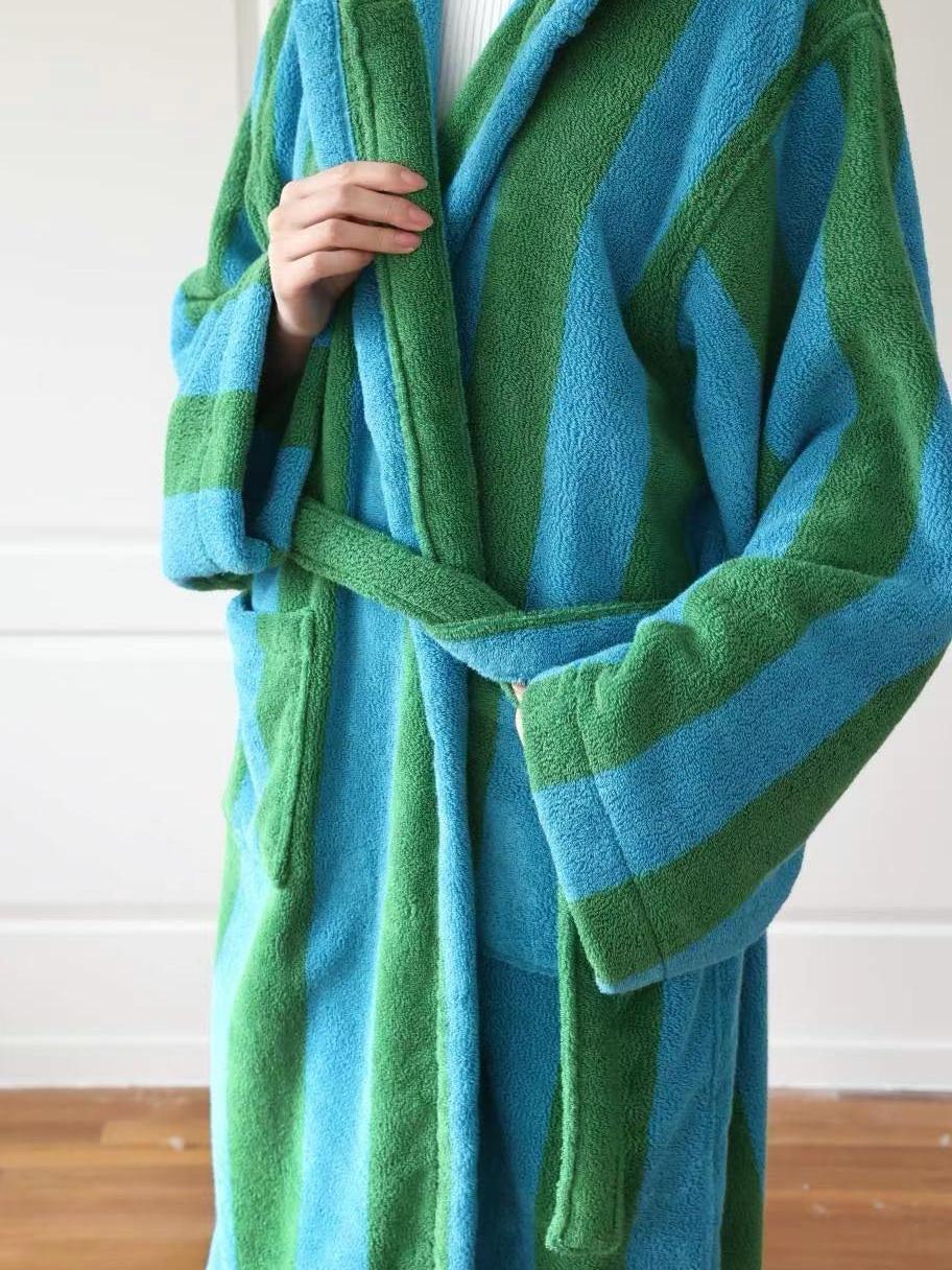
Cotton Terry Striped Bathrobe
Extend the spa vibe beyond the bed. This plush, absorbent robe in classic stripes is perfect for lounging during your Galentine’s self-care rituals.
Shop Now
Colorful Round Pleated Velvet Cushion - Silver Grey
A touch of sheen creates elegance. This silver-grey velvet cushion creates a focal point on your bed without disrupting the serene colour palette.
Shop NowPeople Also Ask
How do I make my bedroom feel warm without using red?
Focus on texture and tone. Use "warm neutrals" like oat, sand, and mocha rather than cool whites. Layering materials like velvet, washed cotton, and faux fur adds physical warmth that visually softens the space.
What is the 60/30/10 rule in bedroom styling?
It is a classic decor ratio: 60% of the room should be your main colour (walls, large rugs, main bedding), 30% a secondary colour (curtains, feature wall, throws), and 10% an accent colour (cushions, art, lamps). This ensures balance without boredom.
Can I mix warm and cool tones in the bedroom?
Absolutely. A "Oat" palette often benefits from cool white accents to keep it fresh, while a cool "Soft Grey" room warms up beautifully with timber furniture or brass lighting fixtures.
Your Galentine's Refresh Awaits
Whether you are drawn to the nurturing embrace of the Rose palette, the clean simplicity of Oat, or the rich depths of Mocha and Berry, refreshing your bedroom is one of the kindest gifts you can give yourself. It creates a space where you can recharge, reflect, and relax—long after the Galentine’s celebrations are over.
We would love to see how you style your sanctuary. Which palette speaks to your personality? Share your bedroom refresh with us by tagging us on Instagram and Pinterest. Ready to start your transformation? Explore our collections by size to find the perfect fit for your bed.